Skip to the main content.
Downloads Thriftly Login
Group 762

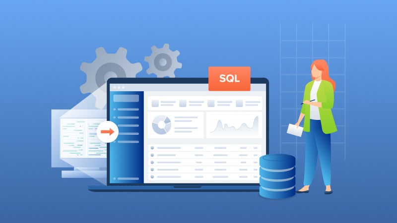
Migrate and run DataFlex applications with Oracle, MS SQL Server, PostgreSQL, MySQL &  MariaDB.

flex2Crystal

Stuck in Crystal XI?  Upgrade and use the latest versions of Crystal Reports with DataFlex applications. 

BTR2SQL

Seamlessly convert from Btrieve transactional database to PostgreSQL, Oracle, and MS SQL Server.

thriftly-1

Quickly build multi-protocol web services with the same API. Supports JSON-RPC, REST, SOAP,  Thrift, and gRPC.
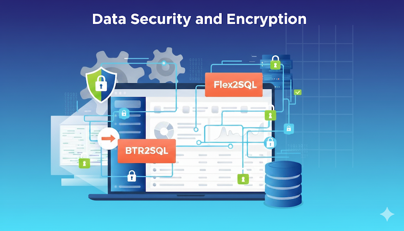
 Group 671-1


Why Mertech?

1 min read

Campfire #9 : Responsive Web Design for the Mobile Era [Webinar 38min]

On December 18, 2013, Mertech continued the Campfire initiative with a session on Responsive Web Design, which was led by Mertech representative Aaron Gulack (Developer) and included participation by Oliver Nelson (Senior Technologist @ Mertech) and Jeff Evans (Web Designer @ Mertech). In case you missed it, here is the slide presentation and video above.


The session began by discussing the evolution of web design from the long-used fixed layout to fluid layout, which was an improvement but didn’t address the issues involving mobile devices, to responsive design, which incorporates both of these approaches as well as many others to create a smooth look and feel across all devices and to optimize speed and functionality.  Using responsive design, issues such as navigation, smaller screen sizes, high resolution images and touch events can all be addressed and fixed. Examples of how this can be achieved include removing mouse-over effects, hiding certain images, moving to a single column layout and changing the menu bar to a drop-down.


There are specific techniques that are used to achieve a responsive design:


Flexible grids, in which the page is split up into virtual columns, giving it a grid-like structure where the number of columns decrease as you move to smaller browser sizes, resulting in the page elements automatically readjusting themselves as needed.


Media queries:  conditional blocks of CSS, usually driven by the width of the browser.


Responsive images:  with a responsive approach, a fluid layout is often used for images. This is done by setting an image to a percentage of the browser size, giving it a maximum and minimum width and allowing it to change relative to the browser.  In addition, there are many tools which enable images to load differently depending on the device, thus optimizing loading speed.  One example of this is Sencha.IO, in which the image is accessed through a cloud that automatically resizes the image as needed.


Aaron covered some tips for getting started which include using a mobile-first approach and using a framework such as bootstrap.  He also showcased Mertech’s new website which deploys a number of responsive design techniques.


During the Q&A session, a number of questions were raised, notably how the concept of responsive design is handled with a VDF Web Application framework (it isn’t, VDF has given the Web App Framework a Windows application look, which is essentially a fixed layout).


Overall, it was an informative session, and we look forward to the next topic.


Why Migrate from Btrieve to PostgreSQL and other Relational Databases?

Why Migrate from Btrieve to PostgreSQL and other Relational Databases?

Introduction Many independent software vendors (ISV) and corporate users still rely on applications that use a category of database collective called...

Read More
Four Challenges in Converting COBOL Applications from ISAM Databases to Relational Databases

Four Challenges in Converting COBOL Applications from ISAM Databases to Relational Databases

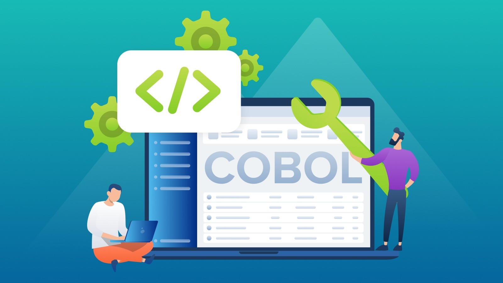
COBOL applications are the foundation of numerous essential business functions, especially within the banking, insurance, and government sectors....

Read More
Application Modernization 101: Ultimate Guide to Digital Transformation

Application Modernization 101: Ultimate Guide to Digital Transformation

Imagine breaking free from the constraints of old, monolithic systems and embracing the agility and innovation of cloud-based solutions.

Read More